Grid Reference
Grid
The grid is enabling responsive design and the possibility to easily rescale widgets.
An instance of AURUM Navigation is considered to be a 24-column grid. This means a widget’s size is stored as how many columns and rows it spans.
🟡 The grid always has 24 columns in edit mode and breakpoints are disabled.
Widget Size and Position
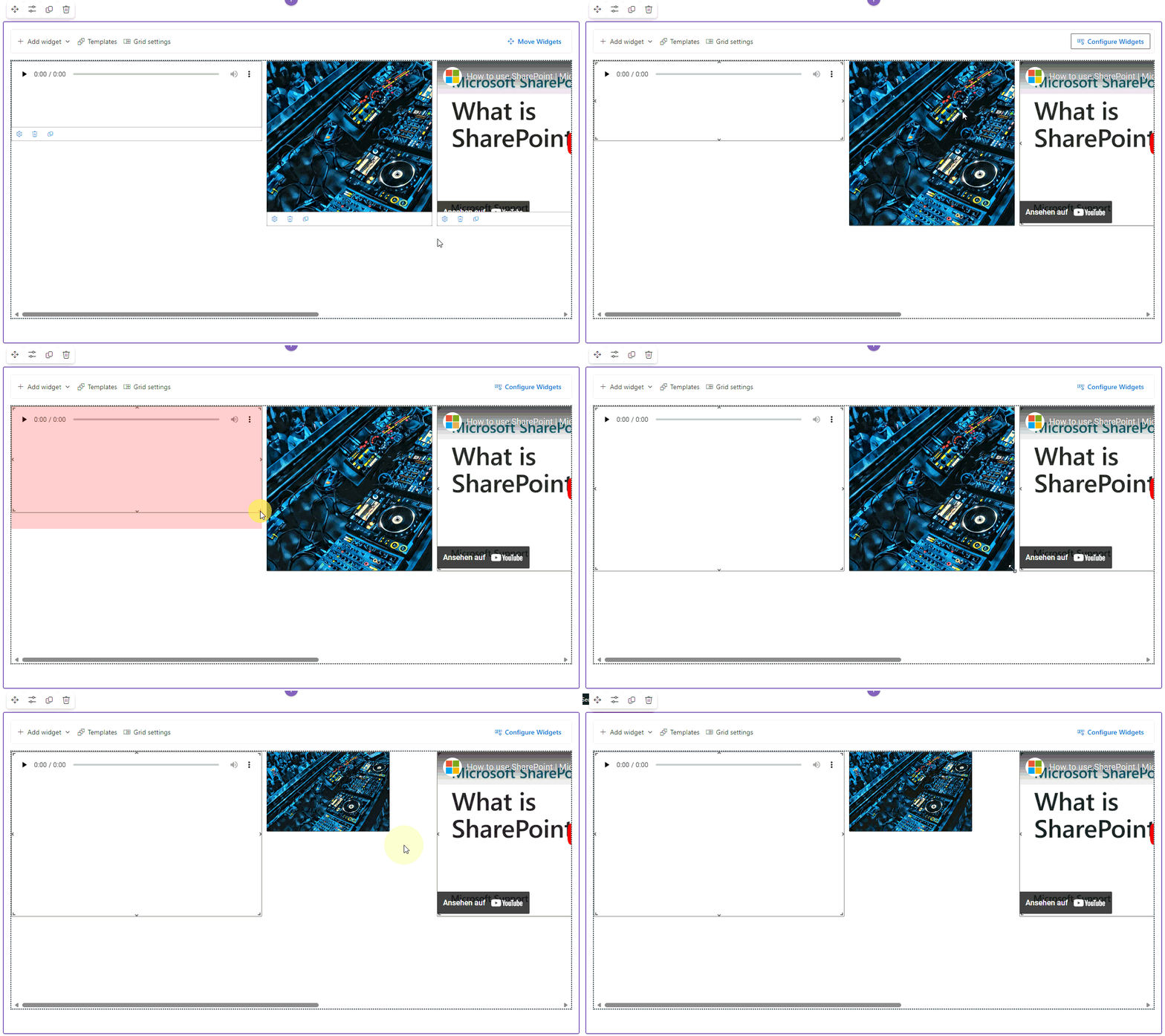
In our grid system, you can easily resize and move widgets around. This allows you to create a unique layout for your navigation. To do so, you need to be in edit mode and click on “Move Widgets” button in the top right corner.

Resizing of widgets
A widget’s size is stored as how many columns and rows it spans. Change the size of a widget by grabbing the resize control and move your mouse.

If widgets are placed next to each other and the width of the user’s device changes, they may wrap to the next row.
If a widget spans more columns than the user’s device provides, it rescales automatically to match the full possible width.
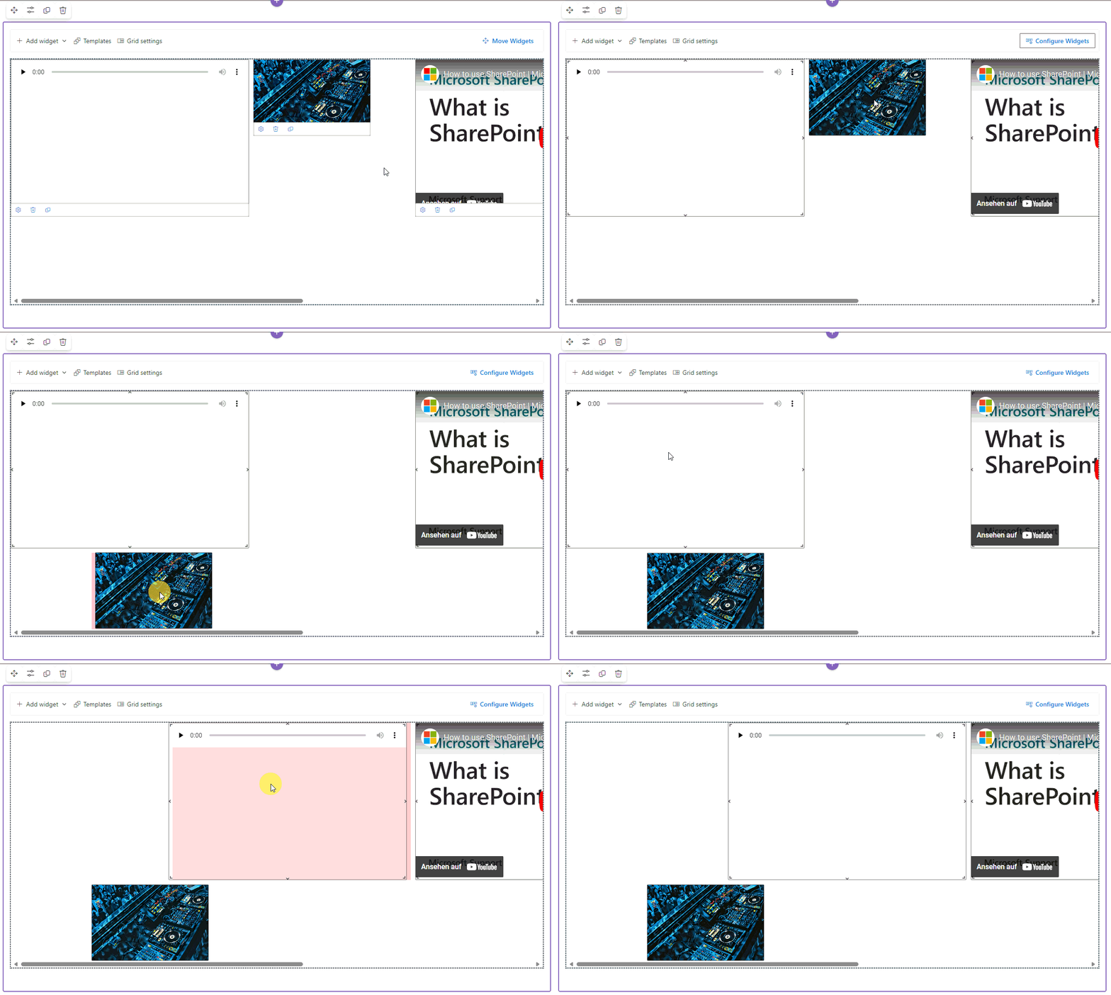
Moving of widgets
A widget can be placed at any place of your grid while in edit mode. Hover the widget and click the gray overlay that appears.s

The grid tries to fill empty space and respect the user’s device if you leave edit mode. So be aware that the position of a widget may change.